
OpenAsset's rebrand: one platform, built to grow

Why now: two products, one name
"A brand creates more friction than value if the customer needs a diagram to understand your product offering."
From DAM to OpenAsset Source
The name is actually inspired by our customers. "We have many customers calling OpenAsset their 'source of truth'," Liou says. The moment images start to get resized and approved narratives get edited, version control becomes complicated very quickly. "In this product, everything is the memorialized version of an asset. This is taken very seriously by our customers, and by us as well. We are just leveraging this by naming it Source."
Why a platform matters
This change also comes from who is doing the buying. After years of building solutions for the AEC industry, OpenAsset evolved beyond selling to just marketers. This was solidified when OpenAsset collaborated with Solidquality to chart its buyers for its brand research. "We're now selling to entire buyer committees," Ries states. "I hear more and more from customers whose entire leadership team has overruled an order their buyers made."
"It is a platform that becomes increasingly valuable the more you use it."
The design: boundless structure and kigumi
But the real inspiration was kigumi, a Japanese joinery technique used in the construction of temples and shrines without any fasteners. As Santandrea describes it, "These joints take advantage of the cut and grain of the wood to reinforce the entire structure, but still remain flexible in an earthquake-prone region. This mantra of 'strength through connection' is what we envisioned with the products connecting, and how OpenAsset connects with its customers every day." The grain of wood has been incorporated into the colored logo design and into patterns based on kigumi joinery.

For Ries, the inclusion of the grain of wood was an important element the team valued. "It serves as an organic counterpoint to the technology-driven nature of our product, as well as being a shout-out to sustainable business practices," he comments. "More than anything else, we fought hard to preserve simplicity in our logo design." He notes that of the three logo concepts the team loved, "the one we chose is so simple that it is almost shocking."
The colors speak the same language. Each product has a unique color, and all of them combine to make up the gradient in the color scheme of the logo. The color palette is centered around Cobalt Blue, and includes other accent colors such as Aegean Teal, Violet Lake, Crimson Rose, and Golden Ochre. A small point which is likely to go unnoticed: the main black color used by the brand is really a very dark blue. "We refer to it as Charcoal Blue," explains Santandrea. "In print it will look like black, but on digital displays, you'll notice the rich hue that complements the rest of the color palette."
Liou, who helped build OpenAsset's Product Design Team, thinks that the new brand identity matches well with the products. "Truly great product companies are always distinguished by their designs," he says. "While the old brand was doing a great job, the new one seems more elegant, more premium and far more modern."
An evolution, not a reinvention
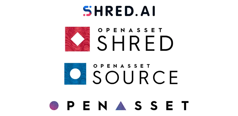
The decisions happened in waves, as Ries tells us. "Should we keep OpenAsset as the parent brand? Should we go from Shred being a separate brand to being a sub-brand? That was hard because the Shred brand was loved. Should we name products using a modular naming system? Should we develop a logo? We started working on all of that in late 2024, right around when the Shred project began, getting feedback from the subject matter experts all along the way," he says. "I'm not an AEC marketer. I market to AEC marketers."
"So our subject matter experts were invaluable," he adds. "They gave us feedback and helped validate the work all along the way." And the process required a little bit of humility, too, Ries adds. "I remember a concept that I loved, but the team and our partners felt it was too similar to something else. They were strongly against it, so I stepped back and let them steer. I didn't let my ego decide, and I'm glad I didn't, because we ended up somewhere better."
Built for what comes next
The platform architecture also serves as a platform for growth. With a defined parent brand and product brands below it, OpenAsset can extend its functionality without reinventing the wheel.
"This provides us with the flexibility to grow with the industry," explains Liou. "In terms of new capabilities and new products, we have a setup now that allows us to fill in a lot of gaps in the industry. There are many products out there in the AEC world, but there are a lot of unmet needs and pain points out there that don't really have any good solutions right now in the marketplace. And I think, at all times, that OpenAsset should design creative and innovative solutions that surprise and delight our customers."
The goal is to complete the cycle of AEC marketing and business development initiatives through the creation of new opportunities. The naming system is designed for that. "We have already developed the names for our next products that are on our roadmap, but you will have to wait for them. Keep an eye out," says Santandrea.
Ries sees the launch as only the first step: "A brand is a living thing, and we're launching in mid-October with even more coming out at the end of the year."
"This provides us with the flexibility to grow with the industry."
Measuring success
"How will you know if the rebrand was successful after one year?" For Ries, the answer comes down to who is selling OpenAsset. "Today, a marketing person who is fond of OpenAsset has to make their principal buy into the idea. In one year, I want principals talking to their marketing teams, saying that we need this. Our marketers will always remain central to us, and we will continue supporting them, but this time, they shouldn't have to carry the burden of selling the idea alone."
He also appreciates the mentality that starts from the top. The CEO of OpenAsset, Jason, celebrates 16 years at the firm this October. He began in customer success, and to this day he still believes in doing the right thing for customers. "The mentality is consistent throughout," says Ries. "The customers deserve better, and this is a huge move towards providing it."
"In one year, I want principals talking to their marketing teams, saying that we need this."
The aec+tech Takeaway
The OpenAsset branding strategy simply gives each product its own lane under one umbrella. Under the parent brand, OpenAsset Source and OpenAsset Shred have their own identities but exchange information within integrated workflows. The team retained the trust, warmth, and name associated with the previous brand, and the new structure allows for additional products as industry demands change.
To learn more about OpenAsset, visit their page on aec+tech or explore more on the official OpenAsset website.

Chief Marketing Officer at OpenAsset, Derek Ries, oversees marketing and is instrumental in helping AEC firms consider how content, data, and AI may help their growth. With 15 years of expertise in demand generation and marketing operations, he is also an early adopter of AI applications and writes on AEC technology, pursuit strategy, branding, and the new role of marketers in professional services firms. In this article, he explains why OpenAsset rebranded and how the new identity came together. Learn more about Derek.
Recent Articles
Learn about the latest architecture software, engineering automation tools, & construction technologies